Elevate Your Website Design with Media Grid
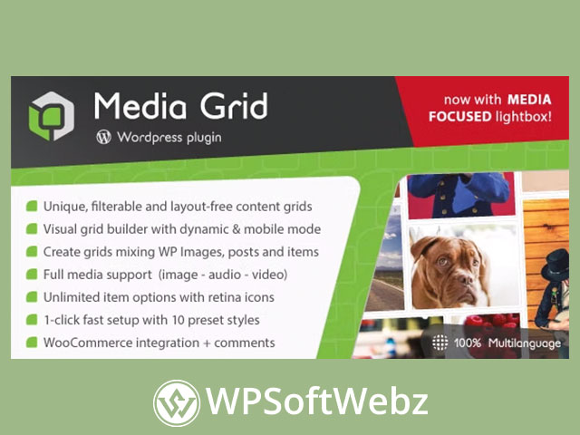
Media Grid is a unique WordPress plugin developed to enable limitless creativity in crafting responsive, filterable, and paginated portfolios. Relying on advanced CSS and JavaScript techniques, Media Grid offers users an unprecedented level of customization by stimulating your imagination to create layouts that can adapt seamlessly to any container.
Dynamic Layouts and Mobile-Optimized Functionality
Media Grid’s key strength lies within its versatile layout choices. It allows you to have complete freedom and control over the grid elements and their layout. You can either go for a manual mode, which offers complete freedom, or opt for dynamic mode, which helps to create expansive grids in mere minutes. The plugin presents an intelligent system, which automatically switches to a simpler and mobile-optimized version for small-screen displays, ensuring a flawless display on all devices.
Diversity with Full Media Support
Another highlight of Media Grid is its full media support, featuring 14 different item types for your portfolio. Everything from simple static images, a fully responsive images slider, audio players, to external linked tiles and custom content, the variety is exhaustive. Furthermore, Media Grid integrates each item with popular social networks for a coherent sharing system, focused on the real item content
Utilize Existing Content with Media Grid
Media Grid recognizes and eliminates the redundancy of re-creating content, and is indeed versatile, allowing you to bring in content from any public post type or your WP Media Library. This savior of time and effort means you can import your existing posts or WooCommerce products straight into visuals in the grid builder.
Seamless WooCommerce Integration
Being seamlessly integrated with WooCommerce, Media Grid furnishes an impeccable solution to showcase your products. As native items, they can be customized and mixed with other item types without any change to the WooCommerce core.
Explore Media Grid’s SEO Friendly Features
Media Grid’s lightbox is entirely managed by lightweight CSS code and optimized for search engine visibility. The HTML5 functions create true URLs for each element – be it lightbox, filters, pagination or even item searches – without any third-party solutions.
Comfortable 1-Click Setup and Translation Ready
Media Grid is accessible right out of the box. If you are unfamiliar with site creation or pressed for time, you can make use of one of the 10 preset styles that can be enabled with just a single click. Furthermore, it’s 100% multilingual, making it convenient for users worldwide.
Overall, Media Grid is thoughtfully developed to enhance the experience and capabilities for WordPress users, bloggers, and marketers. Don’t restrict your creativity to boxed themes; build, design, and present your digital space the way you envision it with Media Grid.
